
HCI Lecture 3 : Dark Design Pattern
Dark design patterns are unethical or deceptive design practices that trick or manipulate users into taking actions they might not want to. I learned a lot about them on this website.
Here are different dark design patterns and ways to redesign them to achieve more ethical and user-friendly alternatives:
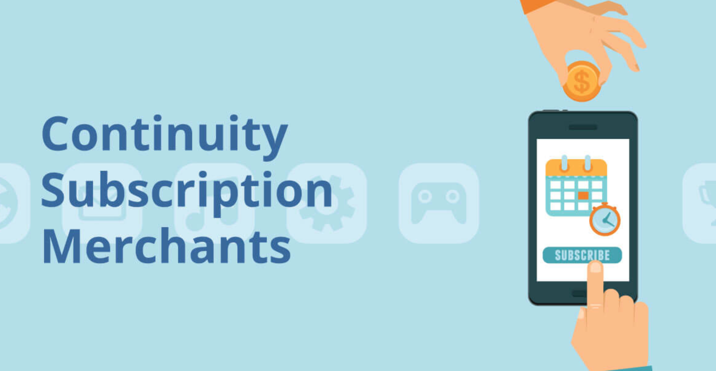
- Forced Continuity in Subscription Services
Some subscription-based services, such as Amazon Prime, Disney Plus, and Netflix, employ a dark pattern known as “Forced Continuity.” This occurs when users sign up for a free trial or a subscription with the promise of a simple cancellation process but find it intentionally difficult to cancel or terminate their subscription when they wish to do so. These services often hide or complicate the cancellation steps, leading users to continue paying for a service they no longer want.
I have personnaly seen an improvement for these well-known applications but this dark pattern remains present in a lot of website. I think they should implement a straightforward and easily accessible cancellation process within the user’s account settings and especially avoid burying the cancellation option deep within menus or requiring users to contact customer support.
Furthermore, sometimes the conditions of the trials are not clear, so they should clearly communicate the terms of any free trials, including the duration of the trial and when regular billing will commence. Th best would be if an email reminders was sent before billing begins.
Finally, the site should ensure to the users that there are no hidden or surprise charges associated with canceling a subscription. Users should not be penalized financially for canceling their subscription.
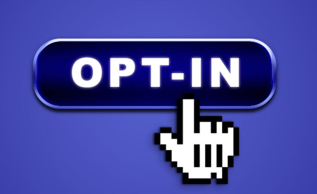
- Hidden Subscription Opt-in
Some websites and apps employ the dark pattern of hiding subscription opt-ins. For example, they might present a pop-up with a prominent “Accept” button, but the “Cancel” or “No Thanks” option is camouflaged, difficult to find, or presented in a way that makes it seem less favorable.
I think it should be redesign by offering a clear choice to the user. Design the subscription pop-up with clear and equally visible “Accept” and “Decline” or “No Thanks” buttons, making it easy for users to opt-out if they choose to. Moreover, there should be a straightforward and non-misleading language used in the subscription request, avoiding any deceptive wording.
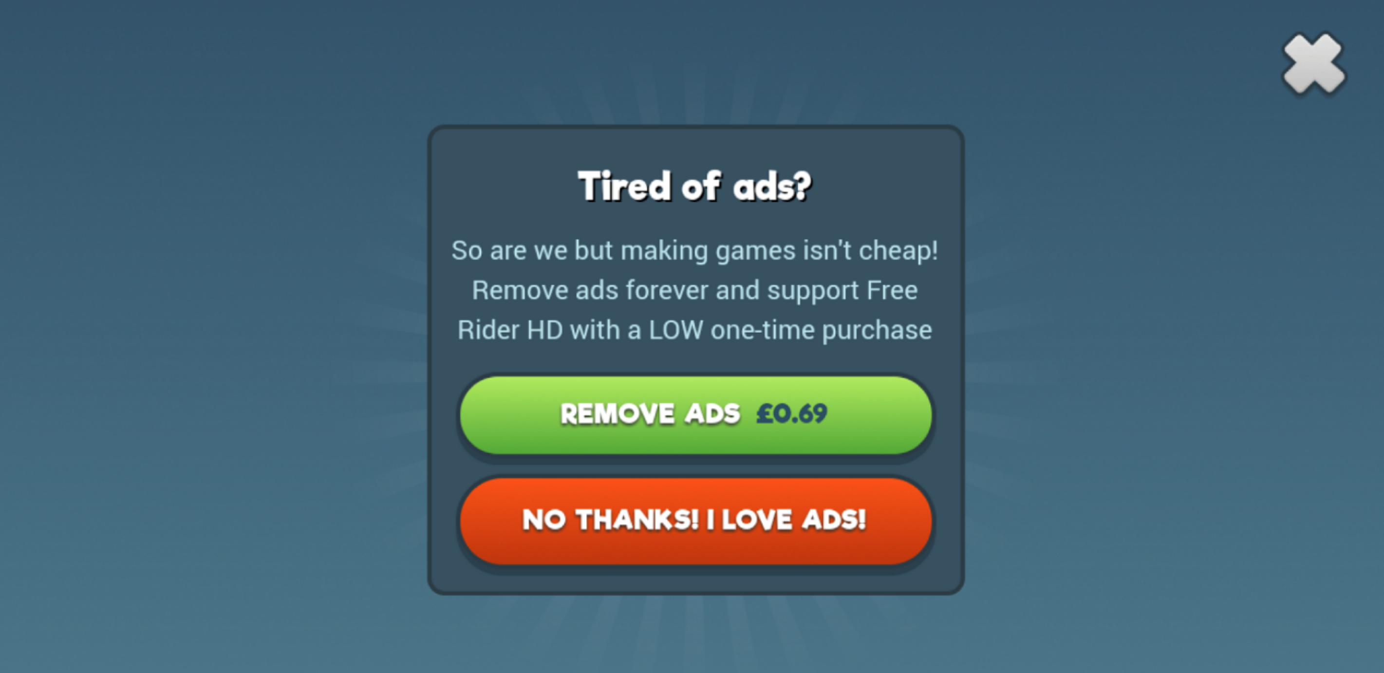
- Confirmshaming
Confirmshaming is a dark pattern where a website or app uses guilt or shame to pressure users into taking a specific action, like subscribing or sharing personal information. For instance, a button might say, “No, I don’t care about saving money” instead of a straightforward “No” or « Cancel.”
To redesign this pattern, the use respectful and neutral lanDguage in dialog boxes or buttons, will allow users to make choices without feeling manipulated or judged. The options should be “Yes” and “No” without introducing negative or judgmental phrases. Finally, instead of using guilt, the pattern should provide users with brief, informative messages about the benefits and consequences of their choices.
By implementing these redesign suggestions, websites and apps can shift away from dark design patterns and promote ethical and transparent user interactions. This helps build trust with users and encourages more authentic engagement rather than manipulation.